From Kerning to Couch Colors—Details Matter
What do water bottles, parking, paint, and landscaping have in common? All are opportunities for branding on your university campus. No matter how big or small, over-the-top or understated, every element on a university campus is an opportunity to reinforce the university brand.
From the moment a person steps onto campus, they are absorbing and reacting to conscious and unconscious signals about your university’s identity. As the primary stewards of the university brand, the marketing team can guide that journey by paying attention to details many employees may overlook.
Be Your Own Guest
Where do you even begin? Start by imagining yourself as a first-time visitor to your campus. Maybe focus on a specific event and think about its attendees. When they turn into your university entrance what do they see? Where do they park? What materials are they given to look over while meeting with admissions team members? Are they given anything to drink? If so, what container does it come in? What buildings and spaces will they see while visiting? What outdoor spaces do they view or pass through?
Disney is famous for its over-the-top attention to guest experience at its theme parks. Channel that energy and spirit of customer service as you physically or mentally walk through campus with fresh eyes.
Baylor University enhanced their guest experience with visual and interactive elements for immersion in the Baylor brand. Their Hurd Welcome Center opened in 2023 and provides brand touchpoints at every turn, from lighting choices to Varsity Coffee and Soda retail space. Guests are guided through each design choice to build deeper connection with the university.
Approach Physical Spaces with a Designer’s Eye
As a marketer, there are brand applications that probably come naturally to you—noticing placement of logos, typography of signage, and uses of your brand colors, for example. These items should follow your visual identity standards just like printed admissions materials or digital advertisements do. Digital signage systems also should fall under your graphics standards umbrella and are a great opportunity to extend the brand with dynamic or timely content.
And you know how important photo-ready spaces are to our social media-saturated lives. It’s crucial to have branded walls or installations strategically spaced through your campus tour route—and accessible to those who wander on to campus on their own—so your guests can fulfill today’s imperative of “pics or it didn’t happen.” Vinyl wall wraps are relatively inexpensive and can serve the dual purpose of providing a shareable branded space while also spiffing up a difficult-to-improve space like a cinder-block wall or dated elevator.
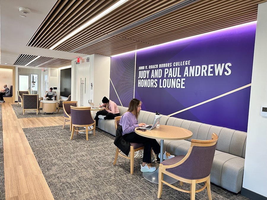
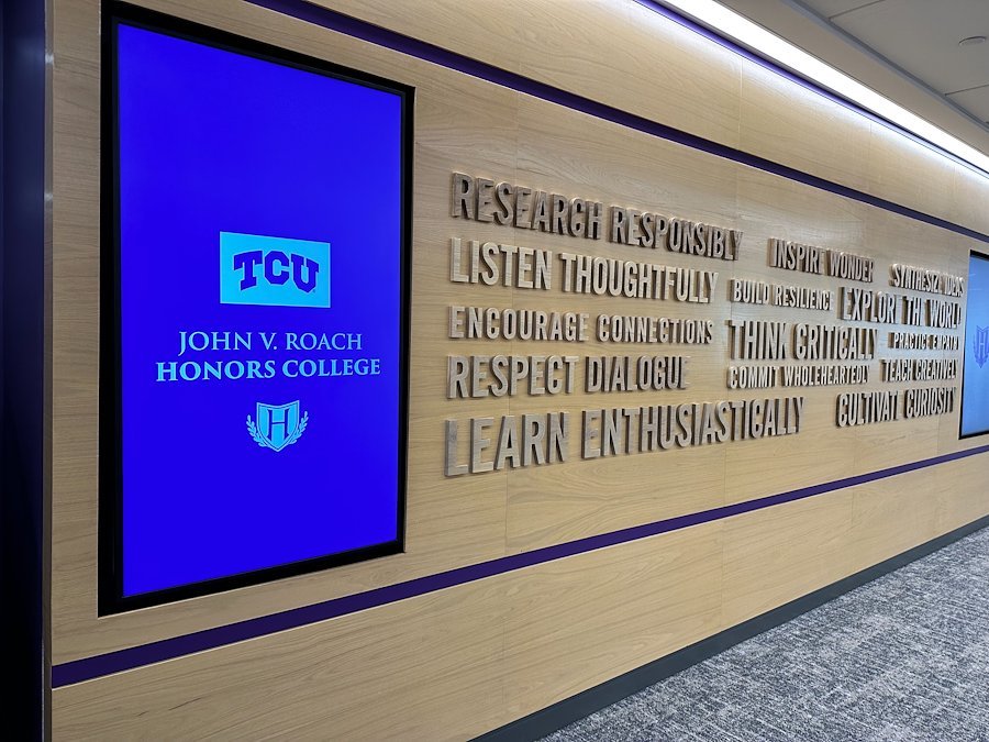
Texas Christian University kept environmental branding in mind in their recently renovated Sadler Hall, home to the Judy and Paul Andrews Honors Lounge and third floor Honors Hub. Every element was thought through, from digital and physical signage to paint and fabric colors, for functionality of the space and brand experience for visitors, current students, and prospective students.
Think Capital-B Brand and Get Granular
Next, take a step back and think about your Brand with a capital B. What is the personality of your institution? What tone do you hope to strike with those who interact with it?
As we know from commas and kerning, small details make a difference in perceptions. The same is true for your campus. What details could be brought in line with your big-B Brand? How buildings and grounds are maintained plays into this, as do interior design choices.
An easy rule of thumb to start with is to let the brand colors rule. Having a set of paint and furniture standards that are utilized campus-wide is ideal and time saving. If that’s too ambitious, start small with some straightforward improvements to key areas of campus where prospective students or donors are most likely to spend time.
Mississippi College’s recently renovated Alumni Hall is a multi-purpose space that reinforces MC’s brand through interior design choices. It combines overt brand elements such as a light-up logo sign with more subtle elements like navy and gold paint and furniture to provide an on-brand experience for students and guests.
Build a Coalition
Most likely, facilities decisions won’t fall under the marketing team’s purview. Reach out to leaders in related areas to bring them onboard with how their work supports the brand of the institution. Offer your services as a team of resident creatives who are familiar with the restraints that production methods and budgets create.
Perhaps your campus already has interior design or signage standards and staff dedicated to those tasks. It’s always helpful to strengthen relationships with teams who have overlapping goals and likeminded—and similarly skilled—team members.
It might be a new way of thinking for the university culture to include marketing in the conversation about what the landscaping or paint colors should be. But bringing more attention and thoughtfulness to details such as these can have positive impacts not only on guest and student experience but also on the perception of the university as a whole. So, let’s roll up our sleeves and get into the weeds!
5° Branding would love to bring fresh eyes to your campus—and brainstorm how to maximize the guest experience to support your enrollment goals. Let’s talk!


