Winning with Print
If you work in admissions and enrollment, you’re moving quickly to connect with students wherever they are. Though a strong digital strategy is essential, print holds a critical place in reaching your audience. There’s certainly no substitute for a tangible take-away piece when meeting with students in person. And while email is the primary preferred means of initial communication for 49% of students, preference for direct mail is still strong, at over 37% (Ruffalo Noel Levitz).
No doubt, though, the Gen Z attention span for print is limited—so it’s more important than ever to make every page count.
Remember Your Different Audiences
When designing a travel piece, your focus is on getting the attention of the students. And students today are all about authenticity. They’ll immediately recognize—and tune out—what’s insincere. Gen Z students will connect with a piece if it’s a genuine reflection of your brand, presented in a style that reflects the world they live in.
For direct mail, it’s likely that mailbox contents will be filtered by parents. So it’s critical to keep these gatekeepers prominent in mind when designing direct mail. Be sure your content addresses the key essentials important to parents.
What to avoid in all cases: thoughtless imitation of popular design. What to do instead: Keep up an awareness of current design trends through your daily digestion of media, giving you a context for what students are viewing. Then apply this general understanding to your own creative process as you communicate your school’s unique brand and values.
Design for Today
In using print well, how can your piece best reflect current design trends? Here are some ideas to try—
Give them something unexpected. Implement a non-traditional fold, shape, or cut or use a unique approach to packaging. This is especially true of anything you send to your highest valued inquiries and applicants—your best bets. Any student on a campus visit should have a strong piece(s) in hand as they leave campus. Accepted students should feel celebrated and valued upon learning of their admittance to your school. For travel, a small die-cut piece of your mascot can help create awareness without high cost. Keep in mind high cost per-unit pieces may create buzz on the road, but weigh that against the reality of how likely they will be grabbed up by students who aren’t serious about your school.
These creative examples have inspired our thinking:
Acceptance Packet—Ringling College of Art and Design
Acceptance Packet—Loyola University Maryland
Die-cut Piece—NYU Stern Undergrad
Use original photography rather than stock photos. You would think this goes without saying. More than just using your own students and physical environments, try to keep your campus photography from looking like stock photography. The classic “three under a tree” or magenta-cast chemistry lab shot need to stay out of your pieces. Gen Z students see these as authentic phonies. Put students in settings where they can be comfortable enough to be themselves—that’s where honesty will come out in your photos. Often, that means casting friend groups together. Create a well-planned shot list where you can cover the breadth of images needed, but embrace a flexible schedule to capture real campus life as it happens. There’s always a bit of magic in the unplanned and unscheduled!
Explore creative ways to make the piece interactive. Add instructions, for example, for posting related content on social media. Or include stickers students can use to create their own story. Make up an interesting checklist, or quiz, or give them something to draw, color, or fill out. Then tell them what you want them to do. Make it easy for them to post and share, and let them put themselves in your school’s story.
Use Your Dollars Wisely
How often do you need printed pieces? This will vary, depending on your comprehensive communication flow. The average student receives 30–40 pieces of communication from a single school (including print and digital), so you need a strategy that takes into account how much is too much, and how to make sure they’re receiving and experiencing the most important information you’re sending. This means you’ll invest more in communicating the priority content. There’s not a silver bullet, and one size does not fit all, so you may need to experiment to find what works best in your context.
How many printed pieces do you need? Again, this will vary, but five to ten print pieces should cover everything you need for students in your inquiry group. We recommend you focus on these priorities for print:
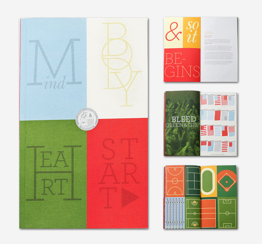
View book, Photo book or similar comprehensive, highly visual piece
Campus visit opportunities overview (seasonal with dates)
“Apply” push
Value/outcomes piece with financial aid info
Financial aid packet
Acceptance/Celebration packet
Print marketing holds strategic value in your recruiting plans. Are you making the most of the potential?
This year, the work of 5° Branding and its clients has been recognized with a bronze award in CASE’s 2017 Circle of Excellence awards and the Grand Prize and eight other awards in the 53rd Annual Wilmer C. Fields Awards Competition of the Baptist Communicators Association.


